Pages

Showing posts with label stamping. Show all posts

Wednesday, 29 July 2015

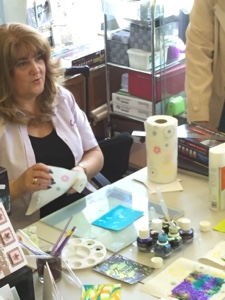
Crafter’s Companion Demonstration day with Dawn Macfie.


AquaTint's introduction with Dawn Macfie.


We was lucky enough to have the very talented Dawn Macfie from Crafter's Companion join us on Saturday to give us an introduction into the world of Aquatints. 

As you can Imagine, there is so much that they can do, much more that can be possibly shown on one blog post, so we shall get started with some tips and tricks


Background 1
Use a few droplets of AquaTints on Sheena card stock. Sprinkle with sea salt and leave until dry. 


Background 2
Apply a few drops of your chosen colours. Crumple up some cling film, and then open up and apply to the card. Leave to dry. When the card is dry you can reuse the cling film again and again.


Background 3
Apply some shaving foam to a glass mat or a non-stick craft mat. Smooth off with a ruler but try not to flatten the foam to much. Gently trace a pattern merging the colours together, and place the card stock on top of the foam. You can generally get about 3 cards from the one application of foam. 


Background 4
Use as brush to create a wash over the card stock. You can blend colours together to create scenes or you can splash/stamp the card stock with water then pat with kitchen towel to create a bleach effect. 

The tints make great background for the create a card dies.

Stamp using archival ink pad or stazon to ensure the inks don’t bleed together.


The Sheena Douglass Victorian floral dies and corresponding stamps work perfectly with the Aqua Tints.


There are 6 sets in the Spectrum Noir AquaTints RRP £24.99
Perfectly Primary, Beautifully Grunge, Landscape, Essentials, Pretty Pastels &Bright and Beautiful. Each set contain’s 6 pots of AquaTint inks, 6 pipettes and 3 brushes. 

The essentials kit contains: silver and gold pearl, which can add a pearlescent tint to any colour. White and Black which can lighten and darken any shade.


Thanks for looking,

Jody x


Thursday, 17 July 2014

Dragonfly Stamp - Spectrum Noir Pencils

Spectrum Noir Pencils and Dragonfly Stamp


They day has come!! I have my hands on them finally....Spectrum Noir Pencils

I stamped out the Dragonfly stamp from Woodware and coloured the back ground in the lightest of the colours first.


Always work light to dark with pencils.
I added glitter for the body to cover a bit of shading that I wasn't happy with or we could say to give it extra dimension. 

I'm not really into making my bits into cards but I felt compelled.....

I still feel like it's missing something but I'm going to ponder that another day. 

Overall thoughts of the Spectrum Noir Pencils - I'm convinced! They blend super easy and I've been told by Gwynie one of our customers that the results look amazing over the Spectrum Noir pens!! (Some thing to blog about another day!) 

Last note - on the Spectrum Noir website there are downloads, top tips and tutorials.

Thanks
Jody x 

Monday, 17 February 2014

Colouring with ProMarkers


We are forever being asked how to colour with ProMarkers. I'm not the best at colouring in or blending but I enjoy it and I'm always pretty happy with the results.

Milton the Dog was stamped on super smooth card in Memento,Tuxedo Black dye based ink pad.

Here he is below coloured with Satin as the base colour, I find it easier to colour from light to dark.


Next I have coloured most of Milton in Tan leaving area's lighter to add character. As you can see I'm not too worried about seeing the lines where it hasn't blended.


Now with cinnamon, colour under the left ear following the curve of his face. Colour a small band following the line of his nose then moving up the right side of his face to create shadow and a 3 dimentional effect.
I used Tan to colour his face, I left a panel above his nose untouched to create a highlight. 
Using the lighter shade (Tan) it blends the cinnamon into the first layer of Tan to 
Colouring over the cinnamon will blend the colours together erasing the lines seen in picture 1.

 Milton's body is coloured using the same method as his head. Cinnamon is added under his chin, left arm pit, arm under the bottle, under his belly and a little around his feet creating shadows.

Blend again with the lighter colour. To add more depth add more of the darker colour. When you've added more of the darker colour continue to blend with the lighter colour or a blender pen.

The colour used for the bottle was Olive Green, and the wine was crimson. To give depth I coloured over certain area's with the same shade. 

I like to add a bit of grey under Milton's feet to stop him floating on the page. And a bit blue to break up the white back ground. 

Let me know if you find any of these pointers helpful. Please watch this space for pointers with colouring pencils.

Jody x 

Thursday, 28 November 2013

November Workshop

This workshop is my one of my favourites.....we all know how I like a bit of inking!! 

In this goody bag the crafter's received...Fairy stamps by Lindsay Mason, 2 mini color box inkpads, white shrink plastic, some yellow spotty ribbon, 2 easel cards and envelopes, and a piece of cut and dry foam! 
The results are great!!

                            By Pat

                           By Zoe

                         By Ann W

It was a really great workshop, with crafter's that had never stamped, used shrink or ink pads before. 

You can't tell that for some of them, these were their first attempts. 


If you are interested in any of the products used please get in touch.